
At the counter, your staff do a lot of quiet selling. They point people to the special, ask if they'd like a drink with that, and warn them the vindaloo is properly hot. Online, nobody's there to do any of it. The menu has to do it on its own.
Most restaurant menus online were put together in a hurry, usually by copying the printed menu line by line. That's a missed chance. A menu built for ordering online gets people to checkout faster, nudges the order size up, and cuts down on "where's my sauce?" phone calls. Here's what we'd change.
Put the dishes people love at the top
A first-time customer opening your menu has one question: what's good here? Answer it before they have to scroll. A "Most popular" or "Customer favorites" section at the top does exactly that, and regulars use it as a shortcut too.
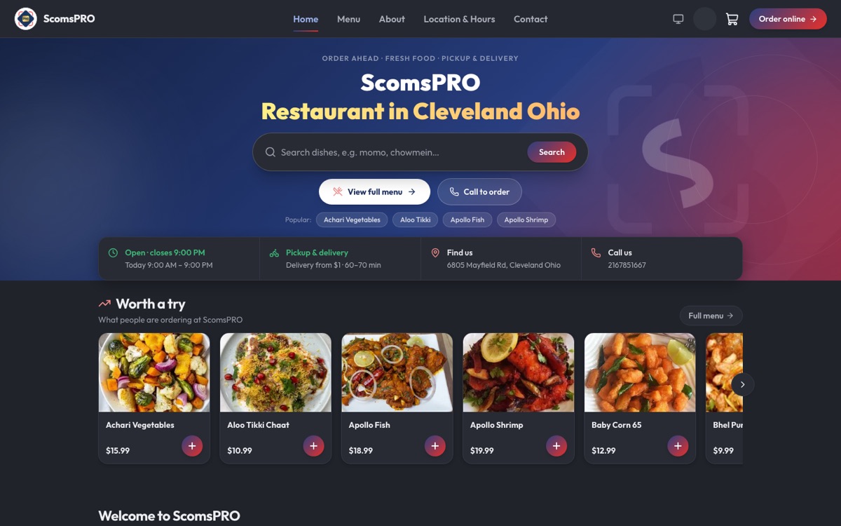
After that, order your categories the way people eat: starters, mains, sides, drinks, desserts. With drinks and desserts near the end, people see them just before they check out. Keep each category to roughly eight to twelve items so it's easy to scan on a phone, and give categories plain names. "Burgers" works better than "From the Grill", for customers and for search.
Photos make the biggest difference
On a small screen, a photo tells someone what a dish is faster than any description. You don't need a professional. A phone and a table near a window will get you most of the way. Shoot in daylight with the flash off, put the dish on a plain plate or in the box it really goes out in, and use roughly the same angle for everything so the menu looks like it belongs together.
If you only get round to ten photos, make them your ten best sellers. And keep the portions honest. A photo that oversells the dish just sets up a disappointed customer and a review you didn't want.
Descriptions: what it is, then why it's good
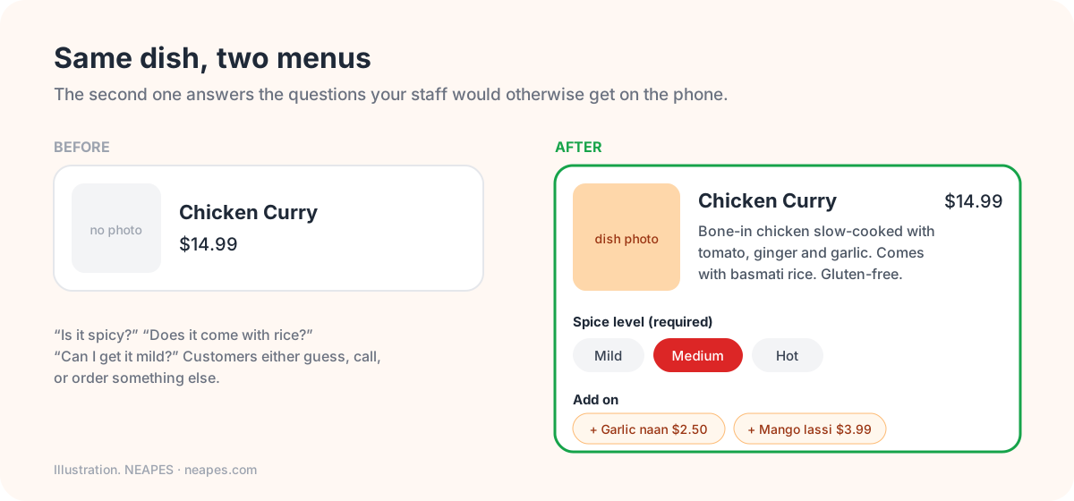
One or two lines is enough. Start with what's in it, add a word about how it tastes, then anything people need to decide: how spicy it is, how big, what it comes with, and dietary notes like vegetarian or gluten-free.
Compare "Chicken Curry" with "Bone-in chicken slow-cooked with tomato, ginger and garlic. Medium spice. Comes with basmati rice." The second answers the three questions your staff would otherwise get on the phone. It also helps you show up in search, because "chicken curry" and its ingredients are now words on a page Google can read. Our restaurant SEO guide explains why that matters.
Options and add-ons are where the order grows
Set up well, options make orders bigger and mistakes rarer at the same time.
Anything the kitchen needs to know should be a required choice: size, spice level, protein, which bread. A required choice is a question you'll never have to phone about. Then add the optional extras with prices, like extra cheese, a second sauce or a fried egg on top. Pre-select the most common choice so most people can just tap "Add".
Combos help too. A main, a side and a drink for a little less than buying them separately is easier than building it yourself. And suggest a pairing where it makes sense, like naan with the curry, a drink with a burger or a dessert with a family meal. It's the online version of "anything else with that?"
Just don't overdo it. Three or four option groups on a dish is plenty. Give people twelve and they'll give up and order somewhere else.
Think about your prices
On your own website you set the prices, and they can be the same as in the restaurant. Many restaurants mark their prices up on delivery apps to cover the commission, which makes your own site the cheapest place to order your food. That's about the best reason there is for people to order direct. If you deliver yourself, cover it with a delivery fee or a minimum order rather than bumping up every dish.
Leave off what doesn't travel
Some dishes are great at the table and miserable after a twenty-minute drive. Crispy things go soggy in their own steam, delicate greens wilt, and anything finished at the table loses the point. Take them off the online menu or make them pickup only. Every dish that arrives limp is a complaint waiting to happen.
Keep it accurate
Mark things sold out the moment they run out, not after someone's paid for one. Use one menu for the counter and online so a price change only happens once. Add and remove specials on time. And once a month, look at what's actually selling online. If nobody's ordered something in weeks, it's taking up space a better dish could use.
A five-minute check
Pull up your menu on your phone and ask yourself:
- Could a first-time customer order your most popular dish in under a minute?
- Do your top ten sellers have photos?
- Does every dish say what it comes with and how spicy it is?
- Is everything the kitchen needs to know set up as a required choice?
- Is there a drink, side or dessert suggested before checkout?
- Are your prices on your own site the same as, or lower than, on the apps?
NEAPES moves your menu onto your own branded ordering website for free (photos, descriptions, options and all) and keeps it in sync with your POS. Customers order pickup or delivery, pay online and earn points, and the order shows up at your counter. See NEAPES online ordering, or read how to set up online ordering, step by step.
Frequently asked questions
How many items should an online menu have?
As many as you can make well for takeout, grouped into categories of about eight to twelve items so they're easy to scan on a phone. Drop dishes that travel badly or rarely sell online.
Do photos really increase online orders?
Photos are one of the most useful things you can add, because on a phone they show what a dish is at a glance. Start with your best sellers, shot in daylight, with honest portions.
How can I get people to spend more per online order?
Use options and paid add-ons, offer combos, put a best-sellers section at the top, and suggest pairings like a drink with a main. A free-delivery threshold also encourages bigger orders.
Should my online prices match my in-store prices?
On your own website they can, because you're not paying a delivery app's commission. Keeping your direct prices at or below app prices gives people a clear reason to order from you.
What should a dish description include?
What the dish is and what comes with it, a word about how it tastes, the spice level, portion size where it matters, and any dietary or allergen notes. One or two lines is plenty.
Tagged: